
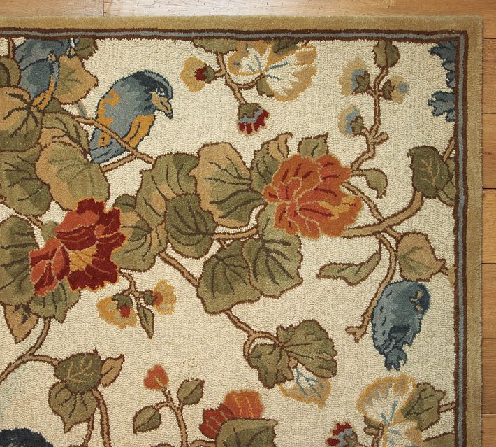
I just bought a new rug. The photos on the Pottery Barn website made it look bright but I knew from the comments to expect more taupe than white.

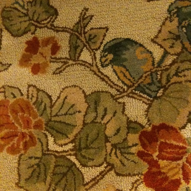
This was the untouched reality (though without much natural light)
I’m totally into my new rug and how well it goes with my other art in my dining room but the taupe background fooled all my usual sites for extracting a color palette. They just kept pulling out the brown even though I wanted to see the greens, golds, pinks and blues. I even tried a site listed in the comments, Dominant Colors, but just ended up with more mud.

I finally found success over on Colourlovers. If you join the site you can upload a color and use a selector to choose which 5 colors you want until you have the perfect palette.
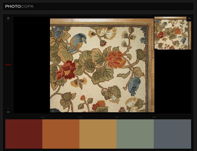
Knowing I have plenty of neutrals in my room already, I was searching for an accent color pulled from the rug that I can use to paint a piece of furniture I bought around Christmastime. The palette came out a little rainbowy but I think I have 5 really gorgeous colors to choose from.

Just from seeing each color, I know I already have a color much like the far right one in the room. I’m leaning towards the sienna shade or the more aqua one. What do you think would look best in the room?
You must be logged in to post a comment.